| Author | Message |
|---|
kinney.
Bulletproof Heart

Age: 32
Gender: Female
Posts: 29482 | November 4th, 2007 at 09:39pm
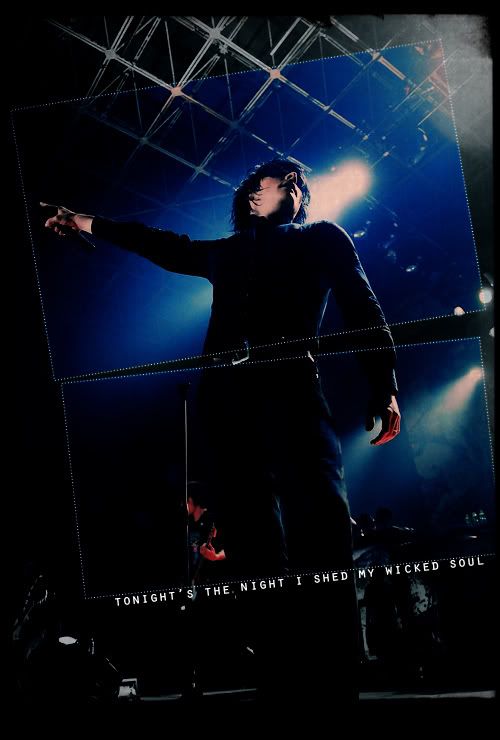
PROS: it's just so simple, yet it says a lot. Overall, truly beautiful
CONS: those lights are really overused.
 |
Megan Vegantoast
Bleeding on the Floor

Age: 31
Gender: Female
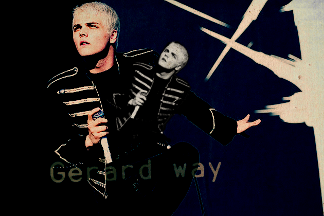
Posts: 1173 | November 4th, 2007 at 11:15pm Pros: great coloring and lyrics
Cons: None that I can see.
 |
melodramatic fool
Salute You in Your Grave

Age: -
Gender: -
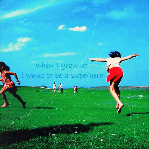
Posts: 2568 | November 4th, 2007 at 11:52pm Pro- the background and the black lines
Con- the framage at the bottom is too grainy.
 |
MJLS
Always Born a Crime

Age: 33
Gender: Female
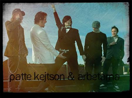
Posts: 6264 | November 5th, 2007 at 07:40am pro's : good blending of the picture in the background
cons : the normal picture doesn't really fit with the colors and make sure the text is easier to read...
 |
F'n'stein xo
Salute You in Your Grave

Age: 35
Gender: Female
Posts: 4520 | November 5th, 2007 at 07:47am pro:nice coloring on the black and white. I like that texture that you got going on there.
con:the font is a little hard to read, but it could just be me.
 |
MJLS
Always Born a Crime
Age: 33
Gender: Female
Posts: 6264 | November 5th, 2007 at 12:27pm pro...nice colors
con : make sure we can see the faces...
 |
The Rumor
Awake and Unafraid

Age: 32
Gender: Female
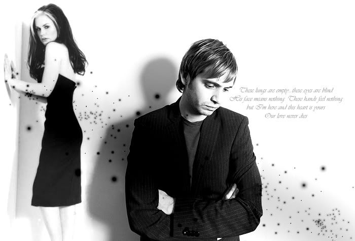
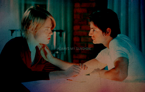
Posts: 11966 | November 5th, 2007 at 10:49pm Pros | The blend is awesome and well thought out and the text is a good opacity.
Cons | the text is badly placed (should be centered and not overlapping either of the Malfoys) and it could do with a bit of coloring...it's also quite bad quality.
 |
Rock Steady
Salute You in Your Grave

Age: 35
Gender: Female
Posts: 3755 | November 5th, 2007 at 10:54pm pro - i like the blend! two awesome photos to chose and i think the words fit prefect
con - maybe less blue?
 |
rumored nights.
Salute You in Your Grave

Age: 31
Gender: Female
Posts: 4054 | November 6th, 2007 at 12:24am Pros: I love how in the boxes, its colored and how the rest is black and white. The text and it's placement is awesome.
Cons: it seems a bit blury-ish.
 |
kinney.
Bulletproof Heart
Age: 32
Gender: Female
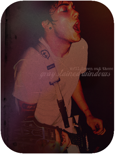
Posts: 29482 | November 6th, 2007 at 10:10pm PROS: The colouring is perfect. The picture is perfect. The belnding is perfect. I love it.
CONS: the text is a weird colour.
---
 |
ema.
Bleeding on the Floor

Age: 31
Gender: Female
Posts: 1008 | November 6th, 2007 at 10:52pm Pros: Love the coloring and the texture.
Cons: The text could be placed somewhere better.
 |
Dr. Spencer Reid
Bleeding on the Floor

Age: 30
Gender: Female
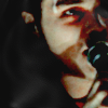
Posts: 1776 | November 7th, 2007 at 12:38am Pro: I love the colouring, it goes so well with the overall mood of the photograph itself.
Con: The text looks out of place and the font doesn't work well either.

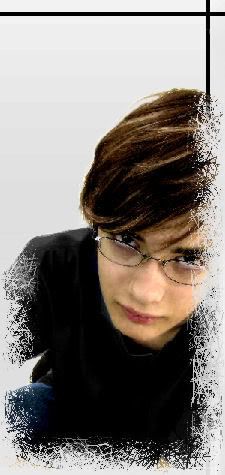
Craptastic.
It's a picture of me I took yesterday.
got really bored and screwed around with the bluriness and saturation.
I used Photoimpression 4 |
hoppy.
In The Murder Scene

Age: 30
Gender: Female
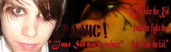
Posts: 24331 | November 7th, 2007 at 04:17am Pros: I like the desaturated skin and the blue hair/green back
Cons: Font's a little iffy... =/
?
|
lana del rey.
Demolition Lover

Age: 33
Gender: Female
Posts: 16030 | November 7th, 2007 at 10:41am Pro: The text is awesome. Good Placement, good font, good technique.
Con: This may not be relevant because it's a personal dislike, but I'm a little over the rounded edges. They're cool and all i just feel they're a little over used.
I don't really make banners anymore so I guess it's an Icon.

|
Arithmetic Doll
Salute You in Your Grave
Age: 32
Gender: Female
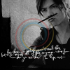
Posts: 4755 | November 7th, 2007 at 01:55pm pros:nice coloring
cons:too simple
 |
ageha.
Bulletproof Heart

Age: 30
Gender: Female
Posts: 25049 | November 7th, 2007 at 04:35pm
pros - the colouring and texture used is great.
cons - it looks like its missing something. maybe some tiny text at the bottom?
 |
joni.
Shotgun Sinner

Age: 30
Gender: -
Posts: 7747 | November 7th, 2007 at 11:15pm pros: pretty much everything about it
Cons: nothing
Current ava? |
blackened
Bleeding on the Floor

Age: 33
Gender: Female
Posts: 1063 | November 7th, 2007 at 11:52pm Pros: The crop is good, and I love how it looks soft and not over-sharpened.
Cons: It could probably use a bit more color. It doesn't look bad the way it is now, but a wider range of colors would make it look better.
 |
kinney.
Bulletproof Heart
Age: 32
Gender: Female
Posts: 29482 | November 8th, 2007 at 12:12am PROS : everything about it. I've never seen anything so beautiful. & the text fits it so well. It makes me smile just looking at it.
CONS : none.
---
 |
Sean Smith;
Salute You in Your Grave

Age: 32
Gender: Female
Posts: 3973 | November 8th, 2007 at 10:33pm
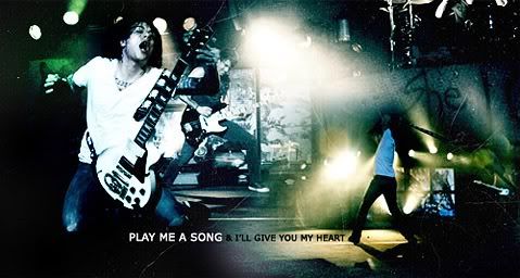
Pros // Love the texture and the pattern at the bottom, it really fits well :]
Cons // None that I can see tbh :]]]
|