| Author | Message |
|---|
sookeh.
Crash Queen

Age: 33
Gender: Female
Posts: 32114 | December 15th, 2008 at 02:55pm
pro: i love the colouring and the crop.
con: nothing.
 |
make some noise;
Jazz Hands
Age: 32
Gender: Female
Posts: 271 | December 16th, 2008 at 10:56pm |
My Hero:
Demolition Lover

Age: 83
Gender: Female
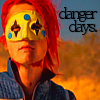
Posts: 18210 | December 17th, 2008 at 12:06am Pros: I like the idea.
Cons: I think that there are too many things going on at once, and I really am not fond of the font you used.
 |
My Hero:
Demolition Lover
Age: 83
Gender: Female
Posts: 18210 | December 17th, 2008 at 12:06am -ignoredoublepost- |
fault lines.
Awake and Unafraid

Age: 29
Gender: Female
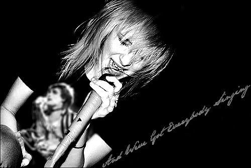
Posts: 10075 | December 17th, 2008 at 12:51am pros:i love the crop and the colouring
cons:probaly just me but the signs are a bit bright up the top and are a bit hard on the eyes
 |
colin meloy.
Bulletproof Heart

Age: 31
Gender: Female
Posts: 25006 | December 17th, 2008 at 01:06am Pros: Nice coloring/b&w/whatever you want to call it.
Cons: It's kind of grainy. Try saving it in higher quality. (:
 |
My Hero:
Demolition Lover
Age: 83
Gender: Female
Posts: 18210 | December 17th, 2008 at 02:01am Pros: I really like the idea, the coloring is nice, and I love the stripes.
Cons: I think a different crop would fit better. imo.
an old one:
 |
make some noise;
Jazz Hands
Age: 32
Gender: Female
Posts: 271 | December 19th, 2008 at 11:44am Pros: I love the crop, the black and white, and the whole idea.
Cons: The lined texture is a bit much, maybe lower the opacity or something?
[I don't know how textures work in photoshop... yet.]
Banner for friend-,
 |
fault lines.
Awake and Unafraid
Age: 29
Gender: Female
Posts: 10075 | December 19th, 2008 at 10:52pm pros:i love this banner, its really cute and creative, the colouring is great aswell
cons:nothing really, its great
 |
malibu.
In the Cannibal Glow

Age: 30
Gender: -
Posts: 54114 | December 20th, 2008 at 01:46am Pros: I love the mixture of black and white / coloured pictures, and the fading of the outer pics.
Cons: I don't like the text placement.
 |
chris pine.
Ghost in the Snow

Age: 46
Gender: Male
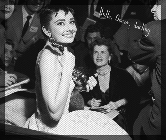
Posts: 64519 | December 21st, 2008 at 12:57pm Pros: I love the cropping
Cons:the coloring isn't very bright, but maybe that's just me.
 |
I Caught Myself
Killjoy

Age: 27
Gender: Female
Posts: 6 | December 24th, 2008 at 09:55pm Pros: I love the coloring of her hair, and the crop.
Cons: There's something about the coloring on her face that I can't place my finger on exactly... it's a little... almost.. .grey?
<My av?
[/b] |
Heartquake
Salute You in Your Grave

Age: 33
Gender: Female
Posts: 4150 | December 25th, 2008 at 07:42pm
Pros: great cropping and coloring.
Cons: nothing!
My avatar?
|
severus.
Awake and Unafraid
Age: 33
Gender: Female
Posts: 12901 | December 25th, 2008 at 08:28pm +: the effect the shirt and flower being in color is cool.
-: Not crazy about the text but it's a minor concern.
 |
malibu.
In the Cannibal Glow
Age: 30
Gender: -
Posts: 54114 | December 27th, 2008 at 04:05am Pros: the colouring is really nice. I love the picture you used, it really captures Christmas. And I like the text placement.
Cons: I don't think the texture fits, but it's probably just me.
 |
sweet disposition.
Banned

Age: 31
Gender: Female
Posts: 48272 | December 27th, 2008 at 06:24pm Pros: I love this, it's gorgeous!
The colouring is beautful, the crop is fantastic and I love it overall.
Cons: Nothing really, except above his left eye is a bit too orange on top for my liking, but that's me being picky.

|
ageha.
Bulletproof Heart
Age: 30
Gender: Female
Posts: 25049 | December 28th, 2008 at 09:33am pros: the blend is good, and i really like the textures.
cons: the font doesn't really fit.
 |
Modern Zero.
Bleeding on the Floor

Age: 31
Gender: Female
Posts: 1669 | December 28th, 2008 at 07:45pm pros: i really love the blending and the brushes/texture. i like how it's black and white on the left, color on the right.
cons: i don't really like the text placement, but other than that I really like it! =D
 |
la cerise
Bulletproof Heart

Age: 29
Gender: Female
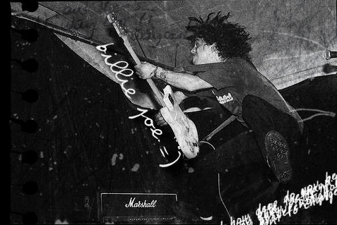
Posts: 26077 | December 28th, 2008 at 08:21pm Pros: I love that it's an old Billie Joe, when he had his dreads.  And the textures and text are great. And the textures and text are great.
Cons: I feel like it's severely unbalanced, with everything being on the right side and not enough being on the left. Maybe the text in the bottom right corner could have been in the bottom left corner or something?
 |
colin meloy.
Bulletproof Heart
Age: 31
Gender: Female
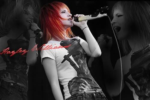
Posts: 25006 | December 28th, 2008 at 10:31pm + I like the colors and the crop.
- you can't really tell who it is, and it actually took me a minute to figure out it was even a person. I mean, I like the silouhette thing going on, but maybe lighten it just a little bit?
It's good overall though. (:
 |