| Author | Message |
|---|
Sean Smith;
Salute You in Your Grave

Age: 32
Gender: Female
Posts: 3973 | October 28th, 2007 at 06:37pm
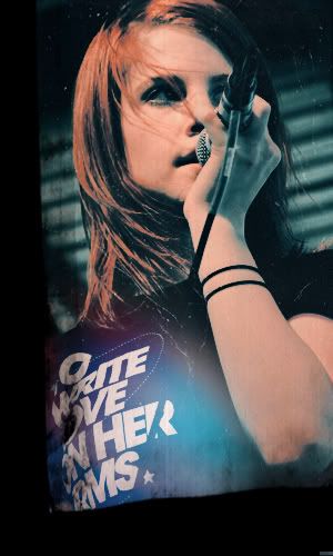
Pros // The change of the colour on the sky looks pretty and I like the border
Cons // The shadow on Gerard looks kinda grainy and the writings abit simple.

|
minimarket.
Salute You in Your Grave

Age: 30
Gender: Female
Posts: 3252 | October 28th, 2007 at 07:00pm Pros: I like the text and the brightness.
Cons: the cropping could have been better.
 |
Juliet Simms
Salute You in Your Grave

Age: 32
Gender: Female
Posts: 2053 | October 28th, 2007 at 07:18pm pros: that texture is nice and it gives it a clean look
cons: I dislike that text, maybe something different could add detail to the banner
 |
kinney.
Bulletproof Heart

Age: 32
Gender: Female
Posts: 29482 | October 28th, 2007 at 07:44pm PROS: It's a cute picture.
CONS: It seems very Blurry & grainy, and the blue-ish texture really doesn't look right. Also, the text is very hard to read.
---
 |
rumored nights.
Salute You in Your Grave

Age: 31
Gender: Female
Posts: 4054 | October 28th, 2007 at 07:47pm Pros: Nice cropping and the pink color makes it look pretty.
Cons: Its a little grainy, and I'm not a fan of the text.
Well, I don't really like text on icons, but thats just me.
btw, i love your name.
 |
kinney.
Bulletproof Heart
Age: 32
Gender: Female
Posts: 29482 | October 28th, 2007 at 07:49pm PROS: The concept is great. The picture you used is great. The texture is awesome.
CONS: although it's a cool texture, it really draws attention away from the band.
---
 |
The Rumor
Awake and Unafraid

Age: 32
Gender: Female
Posts: 11966 | October 28th, 2007 at 07:51pm Pros | The light texture is gorgeous and the coloring is awesome.
Cons | It's like it needs something more to make it stand out, maybe more contrast.
 |
Juliet Simms
Salute You in Your Grave
Age: 32
Gender: Female
Posts: 2053 | October 28th, 2007 at 08:28pm pros: it looks so soft and the coloring is amazing.
cons: I really don't see any
 |
starktreks
Devil's Got Your Number

Age: 31
Gender: Female
Posts: 35214 | October 28th, 2007 at 08:51pm Pros | It's realllyyyy good. The colouring is amazing, as is the picture you used =] Nice text too
Cons | Don't know. Maybe you could have added a border.
 |
ageha.
Bulletproof Heart

Age: 30
Gender: Female
Posts: 25049 | October 28th, 2007 at 09:49pm
pros - the colouring is nice.
cons - the text and the border don't really fit.
 |
Juliet Simms
Salute You in Your Grave
Age: 32
Gender: Female
Posts: 2053 | October 28th, 2007 at 10:34pm pros: I really like the coloring and the cropping
cons: maybe if the colors were a bit more bright then it'd look better
 |
joni.
Shotgun Sinner

Age: 30
Gender: -
Posts: 7747 | October 28th, 2007 at 11:00pm Pros: The coloring is nice
Cons: The text is hard to make out.
 |
Missing Zero
Awake and Unafraid

Age: 33
Gender: Female
Posts: 13405 | October 28th, 2007 at 11:48pm Pros: i love the croping
Cons: i dont like how yellowy it is, a different will make it look fantastic
|
starktreks
Devil's Got Your Number
Age: 31
Gender: Female
Posts: 35214 | October 29th, 2007 at 12:01am Pros | It's great. I love the image and where you put the text. Good colouring, too.
Cons | I can't see anything, tbh.
 |
The Master.
Salute You in Your Grave

Age: 50
Gender: Male
Posts: 2218 | October 29th, 2007 at 12:13am pros: amazing coloring, and great font used.
cons: maybe too many scratches.
 |
starktreks
Devil's Got Your Number
Age: 31
Gender: Female
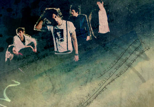
Posts: 35214 | October 29th, 2007 at 12:15am Pros | Fecking cool!!! I love the texture you used and the angle of the 2nd picture. And the colours are GREAT.
Cons | The texts a bit hard to read, and the texture is over the first dude's face a bit. Great job though.
EDIT// Late
 |
starktreks
Devil's Got Your Number
Age: 31
Gender: Female
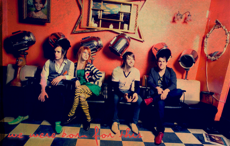
Posts: 35214 | October 29th, 2007 at 12:19am Pros | Absolutly love it. Great colouring, great picture, awesome text and ring things behind it.
Cons | Don't know, really. Maybe a diffrent border?

[Not one of my best..] |
The Master.
Salute You in Your Grave
Age: 50
Gender: Male
Posts: 2218 | October 29th, 2007 at 12:19am ^^pro's: the colors are amazing and i love how the text and circles goes with his t-shirt.
cons: none.
----------
^pro's: i love the contrast with the black and white and color
cons: maybe some text
 |
starktreks
Devil's Got Your Number
Age: 31
Gender: Female
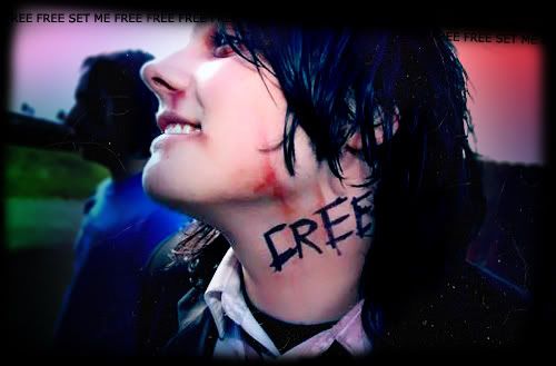
Posts: 35214 | October 29th, 2007 at 12:39am Pros | I love it. I love the colours you used, and the text. I like how the word "Gerard" is kinda split, it looks really good.
Cons | The picture of Gerard is kinda grainy, but I think that's just me.
 |
Missing Zero
Awake and Unafraid
Age: 33
Gender: Female
Posts: 13405 | October 29th, 2007 at 12:46am i love the picture, and the font too
but i'm not sure about the border

|