| Author | Message |
|---|
sookeh.
Crash Queen

Age: 33
Gender: Female
Posts: 32114 | January 27th, 2009 at 03:40pm
pros: i love the colouring and the borders.
cons: i don't like the love heart texture, it looks a little out of place, and is distracting.
 |
joni.
Shotgun Sinner

Age: 30
Gender: -
Posts: 7747 | January 29th, 2009 at 01:26am Pros: The coloring is pretty and natural looking, and I like how subtle the text is.
Cons: It's a little busy, which makes it kinda hard to tell what it is at first.
 |
colin meloy.
Bulletproof Heart

Age: 31
Gender: Female
Posts: 25006 | January 29th, 2009 at 01:46am + the b&w looks nice and I like the textures.
- I would've put the text and that texture somewhere else. it doesn't really fit with the rest of the banner out in the corner like that, I think.
 |
sookeh.
Crash Queen
Age: 33
Gender: Female
Posts: 32114 | January 29th, 2009 at 02:45am |
James Owen. Sullivan
Banned

Age: 32
Gender: Female
Posts: 12000 | January 29th, 2009 at 05:15am Pros: I love the picture/composition
Cons: it's a bit dull, maybe add a texture, epecially to the black part....
 |
snow at christmas.
Crash Queen
Age: 38
Gender: Male
Posts: 31690 | January 29th, 2009 at 12:40pm pros: nice vivid color, nice crop
cons: it's a bit too orange, I think.
but I'm not really sure what's bothering me, I think it's probably the base photo, actually.
 |
James Owen. Sullivan
Banned
Age: 32
Gender: Female
Posts: 12000 | January 29th, 2009 at 04:03pm Pros: I love the colouring + cropping
Cons: it seems a bit dull... maybe add a texture, and make hsi face more visible?
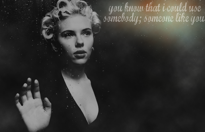
This is way different to what's usually posted on here; i really just wanted to prove to myself that I could do it tbh. I think next time i'll use photos where they aren't making rediculous faces. xD
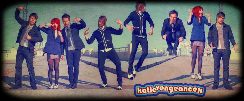
 Katy original
Hayley original
Katy original
Hayley original |
My Hero:
Demolition Lover

Age: 83
Gender: Female
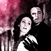
Posts: 18210 | January 30th, 2009 at 07:31am Pros: I really like the idea, and it's really cleanly done.
Cons: Places around her mouth look really distorted from the other picture. And I think it could have a little more color.
<My avatar. |
Arithmetic Doll
Salute You in Your Grave
Age: 32
Gender: Female
Posts: 4755 | January 30th, 2009 at 09:50pm pro:The cropping is great
con:its too simple...In my opinion
|
snow at christmas.
Crash Queen
Age: 38
Gender: Male
Posts: 31690 | January 30th, 2009 at 11:51pm pros: cropping is nice since eyes lead up and foggy area does same.
cons: too much blank space at top.
 |
malibu.
In the Cannibal Glow

Age: 30
Gender: -
Posts: 54114 | January 31st, 2009 at 04:14am Pros: I love the crop, it works well with the way he's standing. And I think the colouring is nice too.
Cons: There's a lot of empty space.
Maaaajor page stretch. |
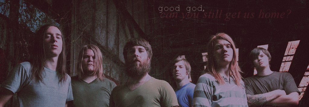
jay!
Bleeding on the Floor
Age: 30
Gender: Female
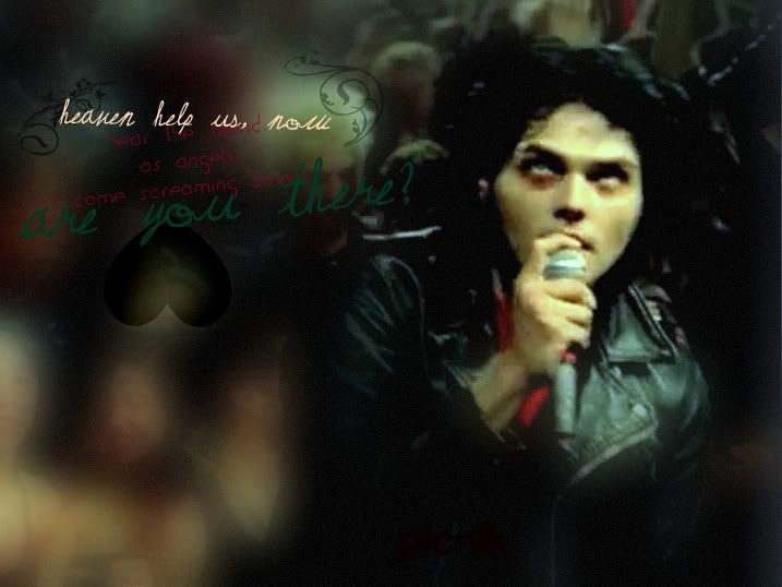
Posts: 1273 | January 31st, 2009 at 06:34am Pros: I love the texture, the colors, the bottom text. Pretty much everything.
Cons: The part that says 'good god' doesn't seem like it fits all that well.
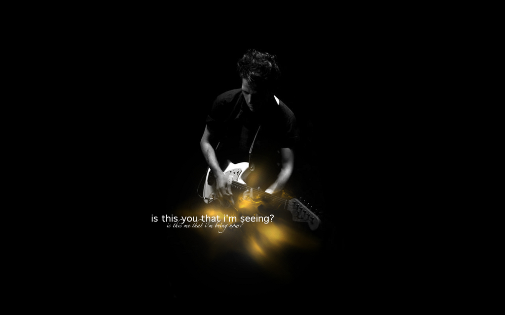
My avatar? |
starktreks
Devil's Got Your Number

Age: 31
Gender: Female
Posts: 35214 | February 2nd, 2009 at 09:25am Pros: Nice crop, and it's very smooth.
Cons: Maybe you could have changed the colouring, and added a texture.
This is old, sorry.
 |
colin meloy.
Bulletproof Heart
Age: 31
Gender: Female
Posts: 25006 | February 4th, 2009 at 03:06am + The coloring looks good and I like how her hair stands out.
- there's something bugging me about it, but I can't exactly put my finger on it... I think the contrast might bee a little too high? And I don't really like how those writing textures are turned sideways.
my avatar? |
electro
Salute You in Your Grave

Age: 29
Gender: Female
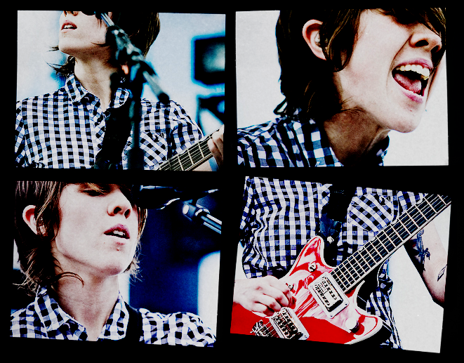
Posts: 3926 | February 4th, 2009 at 06:04am pros;i like how brian is in the centre of the icon so it's not too busy.
cons ; idk really.i think it's fine.

(i just got Photoshop,i'd been using GIMP,so this is the first thing i've done on Photoshop) |
Frnk iero.
Awake and Unafraid

Age: 30
Gender: Female
Posts: 11747 | February 4th, 2009 at 07:17pm
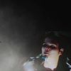
Cons: The coloring blends the wall and shirt together, makig it akward, the lines on his face and hands dont work, His hair is too sharp making it too random, EVERYTHING is too bright, and the picture, although this isn't really anything to judge, seems a bit creepy - it looks like he's pulling off his face. ><
As you can see, I dont like anything about the photo, i'm sorry. :[
I'm aware its a little grainy....
|
rose tyler.
Bleeding on the Floor

Age: 30
Gender: Female
Posts: 1047 | February 5th, 2009 at 04:33pm cons: It's grainy, as you said. It needs colouring and it's blurred far too much around him. The font & text is a bit weirdly placed and the heart is odd too.
Sorry no pros.
 |
Rock Steady
Salute You in Your Grave

Age: 35
Gender: Female
Posts: 3755 | February 5th, 2009 at 04:56pm Pro - i like the blend and the textures and i like the position of the text
Con - this is a TINY point but i can see what i think is the edge of one of the photos in the middle of the light patch.
but really i like it very much
 |
colin meloy.
Bulletproof Heart
Age: 31
Gender: Female
Posts: 25006 | February 6th, 2009 at 07:06am + LOVE the coloring and composition is good.
- none really that I can see.
 |
James Owen. Sullivan
Banned
Age: 32
Gender: Female
Posts: 12000 | February 6th, 2009 at 09:51am Pros: I love the colouring
Cons: idk about the text placement...
 |