| Author | Message |
|---|
severus.
Awake and Unafraid
Age: 33
Gender: Female
Posts: 12901 | March 20th, 2009 at 08:46am
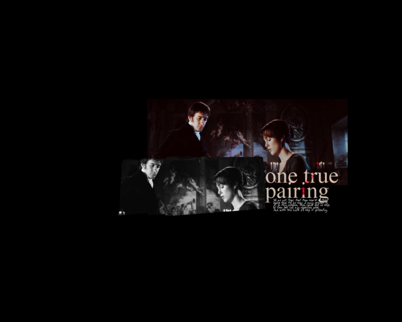
+: It's an interesting picture and the crop isn't bad.
-: I'd play with the color more.
 |
sookeh.
Crash Queen

Age: 33
Gender: Female
Posts: 32114 | March 20th, 2009 at 08:50am pros: i love the idea, and your blending is fantastic. i also like the text and texture. i love it. (: also the colouring is beautiful.
cons: on the far right her shoulder has gone a funny pink colour. and both of them on the far left are lighter than the rest of the banner, and i find that a little distracting.
 |
severus.
Awake and Unafraid
Age: 33
Gender: Female
Posts: 12901 | March 20th, 2009 at 09:24am Thank you. Yeah, that bit's been getting on my nerves and I can't rid of it even though I saved the psd. :[
--
+: The coloring is really lovely and the crop is nice.
-: Not wild about the background but it's still a very nice icon. :]

I added a light texture to hopefully distract from pinkish arm. I don't think it works, lol. :\ |
James Owen. Sullivan
Banned

Age: 32
Gender: Female
Posts: 12000 | March 20th, 2009 at 12:24pm Pros: I like the blending and composition 
Cons: Idk, i liked it better without the light... maybe just decrease the redness/saturation at her shoulder on the right, and make his suit a bit less bright/blue in the photo on the left.
Big
(Made from scratch) |
Skippy.
Always Born a Crime

Age: -
Gender: -
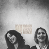
Posts: 5880 | March 22nd, 2009 at 07:57am pros: i like the colours, and the font. it all goes very well together.
cons: i don't really have much crit, except to me, it looks a tiny bit boring.
 |
sookeh.
Crash Queen
Age: 33
Gender: Female
Posts: 32114 | March 22nd, 2009 at 08:00am pros: i like the crop. and yay for toy story!!
cons: i think it is a bit too purple, it takes away from the other colours in the icon.
 |
James Owen. Sullivan
Banned
Age: 32
Gender: Female
Posts: 12000 | March 22nd, 2009 at 08:03am pros:aksdafjl it's so pretty.
cons: hmmm. maybe make the reds stand out a tiiiiiny bit more though that might ruin it. And maybe crop it just a tiny bit larger so you can see the top bit of the hat.
 |
malibu.
In the Cannibal Glow

Age: 30
Gender: -
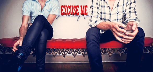
Posts: 54114 | March 24th, 2009 at 01:01am Pros: The colouring is very nice, and I like the crop a lot.
Also the shadow under the bottom line of text looks really good.
Cons: The 'excuse me' looks a bit squished.
Other than that, I think it's really nice.
 |
Arithmetic Doll
Salute You in Your Grave
Age: 32
Gender: Female
Posts: 4755 | March 24th, 2009 at 04:56am
pros: the coloring is awesmone and the text placement is perfect
cons: too much textures....thats all
 |
Skippy.
Always Born a Crime
Age: -
Gender: -
Posts: 5880 | March 24th, 2009 at 05:09am pros: i really like the font, the placement of it and the same picture but in b&w being there.
cons: it looks a teeny bit boring. maybe you could play with the colouring in the top picture.
click here. |
sookeh.
Crash Queen
Age: 33
Gender: Female
Posts: 32114 | March 24th, 2009 at 11:25pm pros: i love the idea of the banner. and you did well with b&w.
cons: the text placement kinda makes the focus of the banner in an odd place, but i don't where else you could put it. :/
 |
Battery Acid
Salute You in Your Grave

Age: 30
Gender: Female
Posts: 3394 | March 25th, 2009 at 03:07pm Pros: Great coloring and cropping.
Cons: None, really.
 |
snow at christmas.
Crash Queen
Age: 38
Gender: Male
Posts: 31690 | March 25th, 2009 at 06:47pm pros: you did some really nice things with the border and whatnot to make that feel far less empty than it actually is, what with the crop putting not much of the image at all in the icon. and I think the brown is a nice departure from the black and white, livens it up nicely without stealing too much attention.
cons: I still think it feels too empty.
 |
schmetallica.
Shotgun Sinner

Age: -
Gender: -
Posts: 9443 | March 25th, 2009 at 08:08pm pros: lovely crop. the coloring is nice for the most part.
cons: i think it's a bit too light with the red tones. maybe play with the curves a little.
 |
Skippy.
Always Born a Crime
Age: -
Gender: -
Posts: 5880 | March 26th, 2009 at 06:53am pros: the crop and colouring is really good! (:
cons: there are none, really.
 |
My Hero:
Demolition Lover

Age: 83
Gender: Female
Posts: 18210 | March 26th, 2009 at 07:28am Pros: I really like the coloring.
Cons: I'm not a fan of the crop. Maybe more towards the body?
 |
John St. John
Shotgun Sinner

Age: 31
Gender: Male
Posts: 7145 | March 26th, 2009 at 06:39pm Pro's: The base image is lovely, and I love the blur effect
Cons: Nothing, I love the avatar.
My Avatar? [I cant be bothered posting it as an image, sorry  ] ]
|
wind opaine.
Patron Saint of Switchblade Fights

Age: 33
Gender: Female
Posts: 66328 | March 26th, 2009 at 10:19pm Pros: It's nice a clear, and the cropping is good.
Cons: A little boring, could use some better coloring.
 |
snow at christmas.
Crash Queen
Age: 38
Gender: Male
Posts: 31690 | March 26th, 2009 at 11:08pm cropping is quite nice, and the simplicity is lovely. I really think it helped it so much that you decided not to cover it in textures and whatnot.
I think it's maybe a bit bright though, and I feel like that lightening bolt would look good with some color. may be totally wrong there though.

because it's a bit unusual and I'm not sure about it. |
Skippy.
Always Born a Crime
Age: -
Gender: -
Posts: 5880 | March 27th, 2009 at 07:29pm pros: personally, i like the fact that it's a bit unusual, it's something different.
cons: it looks a bit boring. maybe if you brightened it up a bit, or played around with the colour it'd stand out more.
click! |