| Author | Message |
|---|
Arithmetic Doll
Salute You in Your Grave
Age: 32
Gender: Female
Posts: 4755 | March 20th, 2009 at 01:56am
bilo.:^I think you're missing a "d" there...
thank you...i was blurred all through out this month |
severus.
Awake and Unafraid
Age: 33
Gender: Female
Posts: 12901 | March 20th, 2009 at 07:15am Two banners. :]

Light textured version
My new header. I don't know..I feel like it's missing something. :\

Also iffy on this one. c/c?
Thank you simon ashtell., butterflies, and brian molko. for the textures!  |
schmetallica.
Shotgun Sinner

Age: -
Gender: -
Posts: 9443 | March 20th, 2009 at 04:17pm I think the text on the lj one could be placed better and the opacity lowered. It's a bit distracting the way the words are so spread apart and how much the white pops.
I like the one with the light brush better, though the opacity could also be lowered just a tad on that also.
The blending and coloring is gorgeous though! And the second one is beautiful. |
severus.
Awake and Unafraid
Age: 33
Gender: Female
Posts: 12901 | March 20th, 2009 at 11:59pm Thank you! (:
I agree with a lot of what you said, especially the light texture opacity on the second version. I think I'll lower it to 45-50%. |
John St. John
Shotgun Sinner

Age: 31
Gender: Male
Posts: 7145 | March 23rd, 2009 at 04:11pm 
I Dont like this much, whatever I do i cant seem to do these things right D:
Any tips on how to improve?
|
schmetallica.
Shotgun Sinner
Age: -
Gender: -
Posts: 9443 | March 23rd, 2009 at 07:52pm ^ I think it's a bit too contrasted. The black margin on the right is also far too large. Maybe you could change the colors of the text so it flows better and so the colors aren't so primary? The two fonts don't really match, either. Sorry, that's a lot of negativity. xD But it's a good start!
These are both olllld but I don't think I ever posted them


c/c? |
Skippy.
Always Born a Crime

Age: -
Gender: -
Posts: 5880 | March 24th, 2009 at 05:11am ^ i quite like the adam one! (:
and the audrey one isn't bad, but i just don't like the whole photo frame thing in the middle. sorry. |
Skippy.
Always Born a Crime
Age: -
Gender: -
Posts: 5880 | March 24th, 2009 at 07:02am this is the first banner that i've made, so crit would be nice.
it was actually for a bebo skin originally, but it ended up being too big.
 |
James Owen. Sullivan
Banned

Age: 32
Gender: Female
Posts: 12000 | March 24th, 2009 at 11:57am 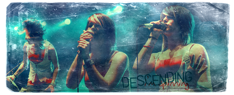
this failed pretty epically =/ |
sookeh.
Crash Queen

Age: 33
Gender: Female
Posts: 32114 | March 24th, 2009 at 12:05pm ^ your blending and colouring is really good.
but i think the texture is too heavy.
i also don't think the fonts look good together,
i'm not a fan of how they overlap. |
savannah's gone.
Bleeding on the Floor

Age: 29
Gender: Female
Posts: 1792 | March 24th, 2009 at 01:10pm |
chris pine.
Ghost in the Snow
Age: 46
Gender: Male
Posts: 64519 | March 27th, 2009 at 08:15pm 
i haven't made any banners in a while.
c/c? |
severus.
Awake and Unafraid
Age: 33
Gender: Female
Posts: 12901 | March 28th, 2009 at 04:01pm schmetallica.: They're both great. I think the first one could be a bit brighter personally. I really love the second one, the blur motion effect is really cool.
hey monday.: Gerard himself is too yellow and I don't like the text. The blue clashes with the background. Blend is nice, though. :]
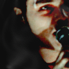
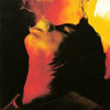
Preacher banner I made last week from this cover.

c/c? |
chris pine.
Ghost in the Snow
Age: 46
Gender: Male
Posts: 64519 | March 28th, 2009 at 04:07pm sally jupiter.:
hey monday.: Gerard himself is too yellow and I don't like the text. The blue clashes with the background. Blend is nice, though. :]
thanks :] |
schmetallica.
Shotgun Sinner
Age: -
Gender: -
Posts: 9443 | March 28th, 2009 at 04:09pm sally jupiter.: schmetallica.: They're both great. I think the first one could be a bit brighter personally. I really love the second one, the blur motion effect is really cool. Thank you.
And that banner is very nice. The coloring is lovely.
(: |
la cerise
Bulletproof Heart

Age: 29
Gender: Female
Posts: 26077 | April 5th, 2009 at 12:52pm  I like it except for the unfocused parts around Candice's chest and on the upper right. The picture came like that I don't know how to get it un-blurred. D;
Help, please? Or c/c? |
Helmee Bluth
In The Murder Scene

Age: 31
Gender: Female
Posts: 20963 | April 5th, 2009 at 07:40pm human malfunction: Whatever program you use will probably have a blur/sharpen tool. You could sharpen those parts with a brush. I know the GIMP has one. |
la cerise
Bulletproof Heart
Age: 29
Gender: Female
Posts: 26077 | April 6th, 2009 at 10:30am Helmee Bluth: Whatever program you use will probably have a blur/sharpen tool. You could sharpen those parts with a brush. I know the GIMP has one. Thank you. I use a program that has a sharpening/blurring tool, but it only works for the whole picture and doesn't allow me to use a brush. :\ I...the only other thing I can think of is to try and download a free program like photofiltre and try to touch it up that way? |
Helmee Bluth
In The Murder Scene
Age: 31
Gender: Female
Posts: 20963 | April 6th, 2009 at 07:53pm GIMP is free, too. |
kings of leon.
Always Born a Crime
Age: 32
Gender: Female
Posts: 6213 | April 7th, 2009 at 03:06pm Natasha Kahn:
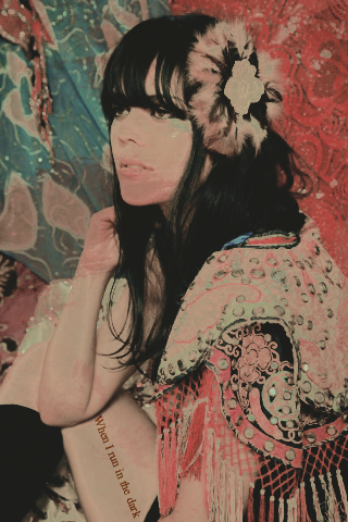
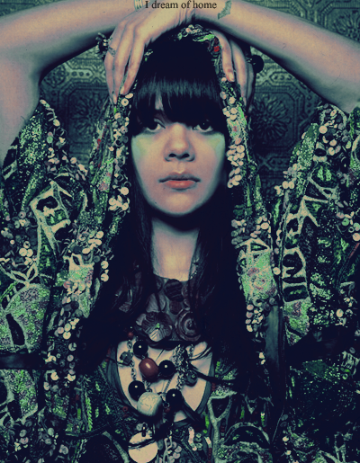 |
