| Author | Message |
|---|
Helmee Bluth
In The Murder Scene
Age: 31
Gender: Female
Posts: 20963 | March 27th, 2009 at 09:02pm
Alright blending and I like the composition.
The color on the band looks very saturated, whereas the background is really dark black and white. It doesn't look as natural as it could. Like, where's all that light coming from?
 |
sookeh.
Crash Queen

Age: 33
Gender: Female
Posts: 32114 | March 27th, 2009 at 11:44pm pros: nice colouring.
cons: i don't like how you cropped off the top of his head.
 |
malibu.
In the Cannibal Glow

Age: 30
Gender: -
Posts: 54114 | March 29th, 2009 at 12:07am Pros: The colouring is gorgeous and the crop looks really good.
Cons: Nothing, I like it a lot. (:
Page stretch. |
loki.
Bulletproof Heart
Age: -
Gender: Female
Posts: 27342 | March 29th, 2009 at 03:18pm pros: I really love the coloring and the textures, and the font compliments the picture really well.
cons: Nothing, really. Maybe add something else to get rid of all the empty space? But other than that, it's perfect.
 Something's a little off and I don't know what it is. :/
 |
Helmee Bluth
In The Murder Scene
Age: 31
Gender: Female
Posts: 20963 | March 29th, 2009 at 07:46pm I like the design on the right side. It's a good contrast to the black and white.
The blending is kinda sloppy. For example, the tip of his nose is blue when the rest of him is black and white. I think you should have played with the black and white photo more, put a texture over the whole thing maybe. It might look more balanced that way.
 |
My Hero:
Demolition Lover

Age: 83
Gender: Female
Posts: 18210 | April 1st, 2009 at 07:29am Pros: I really like the idea, and the coloring is quite nice.
Cons: The crop is just a little bit weird, imo.
<My avatar. |
Xx_kiLL_Core_xX
Killjoy
Age: 30
Gender: Female
Posts: 36 | April 1st, 2009 at 12:08pm pretttty =] |
snow at christmas.
Crash Queen
Age: 38
Gender: Male
Posts: 31690 | April 1st, 2009 at 09:36pm ^ bilo.:
In this thread, what you do is state at least one good thing and one bad thing about the graphic above, and then post a graphic of yours. This is for icons, banners, wallpapers, anything. It just has to be yours, since the point is to help everyone improve their stuff through constructive criticism.
pros: the black and white and simplicity gives the image a really clear feeling and is nice on the eyes.
cons: the crop leaves a huge amount of whitespace, and it feels like whitespace. you need to do something to deal with the blankness. though obviously with this one you need to be careful because by just heaping on a texture or something, you'd spoil the simplicity.

:/ |
malibu.
In the Cannibal Glow
Age: 30
Gender: -
Posts: 54114 | April 2nd, 2009 at 04:18am Pros: I really like the text, and the cropping and pasting of the men over the top. It looks really tidy and nice.
Cons: Nothing really. It's a little sharp around the edges of the men, but that doesn't bother me too much.
My avatar? |
My Hero:
Demolition Lover
Age: 83
Gender: Female
Posts: 18210 | April 2nd, 2009 at 07:29am Pros: I relaly like the crop.
Cons: I think that the coloring is a little bit too purple.
 |
James Owen. Sullivan
Banned

Age: 32
Gender: Female
Posts: 12000 | April 3rd, 2009 at 05:09pm Pros: I loveee the colouring and crop 
Cons: Idk about the texture on her skirt or the text placement...
 |
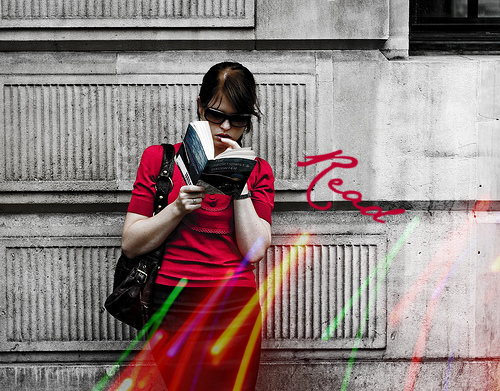
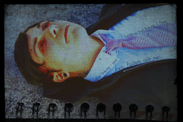
Helmee Bluth
In The Murder Scene
Age: 31
Gender: Female
Posts: 20963 | April 3rd, 2009 at 08:56pm Pros. I like the colors and the font placement/font effects.
Cons. I can't really tell what the image is. It seems too blurry. It looks kinda grainy and I don't know what the significence of the text is.
 |
fault lines.
Awake and Unafraid

Age: 29
Gender: Female
Posts: 10075 | April 4th, 2009 at 01:30am pros: i like the crop and how the flower is the main point
cons: i think the colouring could be a tiny bit brighter imo

(i tried textures in an icon for the first time, so its not very good) |
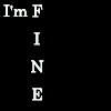
severus.
Awake and Unafraid
Age: 33
Gender: Female
Posts: 12901 | April 4th, 2009 at 02:33am +: It's a nice crop.
-: Texture placement is strange and I think you could play with the coloring a bit more.

Thinking of using it as an FO banner but I don't know if it needs more? |
James Owen. Sullivan
Banned
Age: 32
Gender: Female
Posts: 12000 | April 4th, 2009 at 08:30am Pros: I love the crop and colouring
Cons: maybe a tiny bit less red?
Bigggg. |
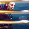
jay!
Bleeding on the Floor
Age: 30
Gender: Female
Posts: 1273 | April 7th, 2009 at 11:52am Pros: Nice blending, good background
Cons: The text (or script, if you will) behind everything else is a bit distracting. It might just be because it's blue, though.
My avatar? |
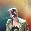
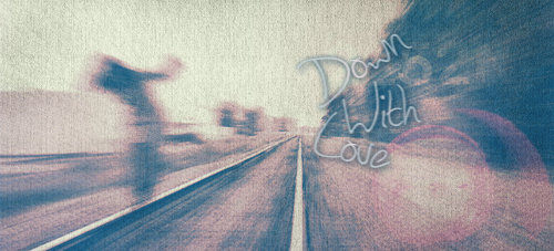
Helmee Bluth
In The Murder Scene
Age: 31
Gender: Female
Posts: 20963 | April 7th, 2009 at 05:50pm Pros: The base image is interesting.
Cons: The cropping is kinda boring and there's too much blank space. The coloring could stand out a bit more. It looks blurry.
 |
My Hero:
Demolition Lover
Age: 83
Gender: Female
Posts: 18210 | April 7th, 2009 at 09:06pm Pros: I love the coloring.
Cons: I'm not fond of the crop. It looks like his face is cut off.
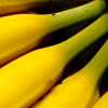 |
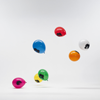
malibu.
In the Cannibal Glow
Age: 30
Gender: -
Posts: 54114 | April 15th, 2009 at 08:09pm Pros: the colouring is simple and nice, and the image you used is nice.
Cons: the crop makes it kinda hard to tell that it's a banana bunch. I know it is, but maybe if you zoomed out a little and included more of the image, it might look a little better?
 |
chainsaws cascading.
In The Murder Scene

Age: 29
Gender: Female
Posts: 22924 | April 16th, 2009 at 11:33am pros: i really like the texture and the coloring
cons: for some reason, that spot above his eyebrow really bothers me and i found it hard to notice the text
 |