| Author | Message |
|---|
idee fixe.
Salute You in Your Grave
Age: 29
Gender: Female
Posts: 3023 | April 17th, 2009 at 12:57pm
Pros: I like the image and the coloring you used.
Cons: I don't really like the cropping for some reason. It kind of distracts me a bit from the person / focus of the icon.
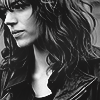
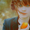
My avatar?
|
James Owen. Sullivan
Banned

Age: 32
Gender: Female
Posts: 12000 | April 18th, 2009 at 07:31am Pros: I love the cropping, and the colouring's pretty cool
Cons: Idk about the text/placement.
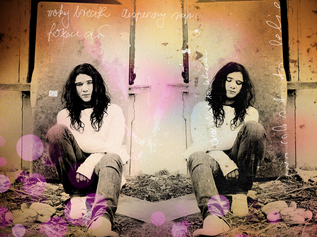
Wallpaper |
Helmee Bluth
In The Murder Scene
Age: 31
Gender: Female
Posts: 20963 | April 24th, 2009 at 10:40pm Pros: It's kinda interesting in how . . . chaotic it looks.
Cons: It's kinda confusing. And having two of him of both sides makes the focus in the empty middle, but it's not really a focus. My eye doesn't know where to land. The colors are all over the place and it's grungy like low quality.
Big banner. |
snow at christmas.
Crash Queen
Age: 38
Gender: Male
Posts: 31690 | April 24th, 2009 at 11:25pm pros: the black and white is really nicely integrated, most of the time you don't even notice that it's changed from color. and the overall feel is great, the color is lovely.
plus, dresden dolls are love. but that's kind of a personal bias. x]
cons: the text doesn't fit with the banner, and amanda's eyes don't fit either. maybe give her lips a subtle coloring instead of the eyes? I feel like the eyes stand out too much and don't fit the color of the rest of it.
 |
Spirit of Jazz.
Motor Baby

Age: 103
Gender: Female
Posts: 918 | April 26th, 2009 at 11:18pm pros: the crop is AWESOME. and i have a thing for black and white.. but that's just me.
cons: mmm... maybe if you added some color... nothing huge, just... like the eyes or something. xD I'm not much help...
my avatar? |
James Owen. Sullivan
Banned
Age: 32
Gender: Female
Posts: 12000 | pros: I love the cropping and colouring
cons: it's a bit dark...
 |
snow at christmas.
Crash Queen
Age: 38
Gender: Male
Posts: 31690 | pros: damn, that is nice. love the figure's hand and head going out of the square. also, having "the used forums" in colors that match the paint adds a nice variation to it without making the text distracting.
cons: I think the "taste" of ink looks weird with the colors in it. I'd make those a bit more solid if I were you. like, not all solid, but not switching so quickly. it just looks like the white is cut out and you can see in, which is weird with the rest of it. also, it's too dark in comparison.
 |
rose tyler.
Bleeding on the Floor
Age: 30
Gender: Female
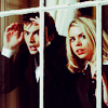
Posts: 1047 | Pros: i LOVE the photo. the text placement is really lovely and i like how you don't notice it straight away.
Cons: i don't really get the meaning of it. it's nothing to do with the graphics ect. i just don't fully understand the link?
A hard banner to judge photo editing skills on imo?
--
 |
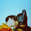
butterflies
Bleeding on the Floor
Age: 32
Gender: Female
Posts: 1983 | Pros: Amazing blending, and the colouring is beautiful. It suits the pictures really well, everything goes together perfectly. I think it would make a great header on lj or somewhere like that.
Cons: His face on the left picture looks a bit blue compared to the other two and maybe you could bring out the text a bit more, like stroke it or something. But other than that, the whole banner looks just beautiful [:
WALLPAPER |
colin meloy.
Bulletproof Heart

Age: 31
Gender: Female
Posts: 25006 | Pros: Lovely coloring, textures and composition.
Cons: My only complaint is that, as a wallpaper, it might be a little too busy? (that's sort of just so I could have a con, though. (: )
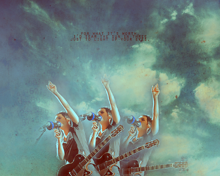 |
chainsaws cascading.
In The Murder Scene

Age: 29
Gender: Female
Posts: 22924 | pros: it's a really nice banner. the texture & everthing is just really nice
cons: the numbers sort of bother me. i don't get what they're there for. they seem to be the first thing i noticed and distracted me from the text and picture
maybe it's just me. but over all i think it's really nice
--
my avatar? |
Helmee Bluth
In The Murder Scene
Age: 31
Gender: Female
Posts: 20963 | Pros: The blue color is nice.
Cons: I don't like the cropping. It's boring. It's like it's just his head and it's practically centered. The coloring could be more exciting.
 |
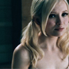
fault lines.
Awake and Unafraid

Age: 29
Gender: Female
Posts: 10075 | May 10th, 2009 at 05:21am pros: i like the colouring and the crop
cons: it looks a little blurry around his face
 |
fun ghoul
In a Bullet's Embrace
Age: -
Gender: Female
Posts: 58705 | May 10th, 2009 at 08:08am i like the colors a lot and the cropping is okay x)
but what i don't like is the caption, it doesn't stand out and doesn't go well with the picture.. but overall, nice job!
 |
chris pine.
Ghost in the Snow
Age: 46
Gender: Male
Posts: 64519 | May 10th, 2009 at 09:32am pros: I like the crop/ coloring.
cons: none that I can see.
 |
Spirit of Jazz.
Motor Baby
Age: 103
Gender: Female
Posts: 918 | May 10th, 2009 at 11:32am pros: I like the way the red stands out against the white, and the crop.
cons: ...nothing. =)
avatar? =D |
fun ghoul
In a Bullet's Embrace
Age: -
Gender: Female
Posts: 58705 | May 10th, 2009 at 11:23pm the color tone is pretty, and the crop is okay, too
cons: none.
 |
Spirit of Jazz.
Motor Baby
Age: 103
Gender: Female
Posts: 918 | May 11th, 2009 at 08:27pm Pros: I like the text overlay- how it kinda blends, but it doesn't, y'know? x] and your guitar is sweet, as well.
Cons: uh.... this isn't your fault, but the 8th note in the overlay's flag should be facing down, and the treble clef is in the wrong place. xD that's it, though.
 |
Helmee Bluth
In The Murder Scene
Age: 31
Gender: Female
Posts: 20963 | May 11th, 2009 at 09:58pm Pros: I like the coloring/mood.
Cons: I'm not so keen on the crop and the black around his face is too . . . black and blank. It looks a little like he's just a floating head.
 |
idee fixe.
Salute You in Your Grave
Age: 29
Gender: Female
Posts: 3023 | May 12th, 2009 at 07:07am
Pros: I like the cropping.
Cons: I find the coloring a bit dull. Maybe something that would bring out the reds and yellows more would have been suitable for this.
My avatar?
|