| Author | Message |
|---|
Don Juan Triumphant
Salute You in Your Grave

Age: 29
Gender: Female
Posts: 2822 | June 30th, 2009 at 08:52pm
its really colorful and eyecatching. i love the coloring. haha i always notice it when looking in a thread
 |
chris pine.
Ghost in the Snow

Age: 46
Gender: Male
Posts: 64519 | June 30th, 2009 at 09:16pm pros: i like the coloring.
cons: i don't like how the boxes cover some of their faces, the boxes are also distracting, imo. It also looks a little plain, you could add some text or another texture.
 |
mona disappeared.
In The Murder Scene

Age: 33
Gender: Female
Posts: 22738 | July 1st, 2009 at 04:30am pros: i love the chop.
cons: it needs more coloring and the light texture should be more visible.

|
append and detach.
Shotgun Sinner

Age: 27
Gender: Female
Posts: 9418 | July 3rd, 2009 at 09:19am pros: love the coloring. The rainbow in the sky shaped like letter N is really nice
cons: none. :]
 |
Jeanne Paulin.
Shotgun Sinner

Age: 31
Gender: Female
Posts: 9905 | July 5th, 2009 at 10:30am
Pros; crop is great, the colour of the background is so pretty.
Cons; the colour of his face is too sharp.
 |
malibu.
In the Cannibal Glow

Age: 30
Gender: -
Posts: 54114 | July 8th, 2009 at 06:16am Pros: The colouring is different, in a good way. I really like it. I also like the simple font you used.
Cons: The backward text was hard to understand and I don't think it really fits. Also, it feels like everything's pushed to the right side, and there's not enough on the left.
 |
exterminate.
Shotgun Sinner

Age: 31
Gender: Female
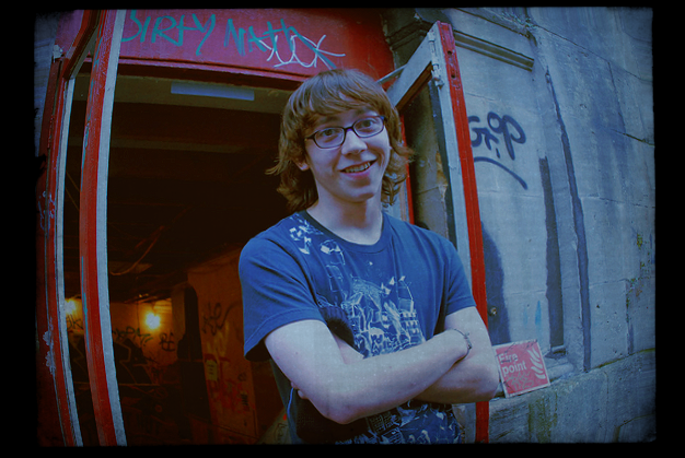
Posts: 9830 | July 8th, 2009 at 09:58am pros: i love the texture used (: and i really like how the person is right in the centre of the banner.
cons:the colouring is a little tiny bit too blue, but that really could just be me x] also it could have more textures or text? :]
my avatar? |
Innamorata
Awake and Unafraid
Age: 33
Gender: Female
Posts: 11838 | July 9th, 2009 at 07:56am Pros: The cropping.
Cons: To be honest, I do not know if it's just me yet I'm unable to see the editing done here. Sorry. :/

An oldies. My photography and editing. |
exterminate.
Shotgun Sinner
Age: 31
Gender: Female
Posts: 9830 | July 9th, 2009 at 08:51am pros: i really like the brightness and contrast and it's a lovely photo.
cons: you could use a texture or more textures.
my avatar?
this is the original: original gwen |
fun ghoul
In a Bullet's Embrace

Age: -
Gender: Female
Posts: 58705 | July 12th, 2009 at 08:17am pros: i really like what you've done with the color and texture
cons: crop could be a little more interesting
my avatar? |
append and detach.
Shotgun Sinner
Age: 27
Gender: Female
Posts: 9418 | July 12th, 2009 at 08:51am pros: the lighting and crop is brillliant. So are the colors.
cons: some parts are too sharp
my avatar? |
mona disappeared.
In The Murder Scene
Age: 33
Gender: Female
Posts: 22738 | July 14th, 2009 at 10:17am + i like the chop.
- i dont like the coloring, its too boring.

|
Frnk iero.
Awake and Unafraid

Age: 30
Gender: Female
Posts: 11747 | July 14th, 2009 at 03:26pm Pros: Pretty, i think the center placing of Adam(i believe?) and the little thing above him is perfect.
Cons: Hes a little saturated, and its seems a bit bright.

Just made. I think it looks darling... ><
|
John St. John
Shotgun Sinner

Age: 31
Gender: Male
Posts: 7145 | July 14th, 2009 at 03:47pm I like it, its pretty great, the text is a little hard to see but I guess it ties in nicely 

|
sailor spaikae!
Always Born a Crime

Age: 30
Gender: Female
Posts: 5335 | July 15th, 2009 at 10:58am I really love the crop but the colouring seems bright but bland. If that makes sense.

It always saves lighter than I expect. |
Helmee Bluth
In The Murder Scene

Age: 31
Gender: Female
Posts: 20963 | July 15th, 2009 at 06:47pm Pros: I like the coloring and the grunge texture, and the text its placement. It's a nice picture and graphic, overall.
Cons: I feel like the frame is too much. Like, it's a bit too much of a harsh difference from the rest of it and not quite right for the mood.
The current header for my LJ. |
Frnk iero.
Awake and Unafraid
Age: 30
Gender: Female
Posts: 11747 | July 16th, 2009 at 11:24am I think the font blends in a bit too much, but otherwise I think the pictures are areally pretty. They match well together. 7/10
Made it yesterday, think its pretty.
|
fun ghoul
In a Bullet's Embrace
Age: -
Gender: Female
Posts: 58705 | July 17th, 2009 at 07:39am pros: photograph is very nice, so are the colors
cons: idk about the textures and the heart on top, kinda distracting.
my avatar? |
append and detach.
Shotgun Sinner
Age: 27
Gender: Female
Posts: 9418 | July 17th, 2009 at 10:55am pros: i like the colors very much. the cropping's a genius work.
cons: none.
 |
fun ghoul
In a Bullet's Embrace
Age: -
Gender: Female
Posts: 58705 | July 18th, 2009 at 03:02am pros: crop is great, so is the photograph you used
cons: a bit of sharpening? and you could do better with the colors : D
 |